A common question regarding PDF accessibility is how to confirm if a PDF document is truly accessible. Automated PDF accessibility checkers are commonly utilized by individuals to identify errors within their PDF files. Nevertheless, these checkers can only identify a portion of accessibility concerns and may overlook up to 75-80% of errors. This is due to the fact that certain aspects of accessibility cannot be determined by a machine alone. Certain elements require human evaluation to verify their accessibility for individuals using assistive technology.
While receiving a passing evaluation from an automated checker is a positive step towards verifying the accessibility of your PDF document, it is important to note that addressing the errors identified by the machine is just the first step. In order to ensure full accessibility, manual checks must also be conducted, particularly using a screen reader. Here are several errors that are frequently missed by automated checkers:
1. Alt Text
The most common issue that users of assistive technology encounter when accessing PDF documents is the lack of adequate alt text. Although a machine can verify the presence of an entry in the alt text field for images, PDF accessibility checkers are unable to verify the accuracy, completeness, and effectiveness of the information conveyed by the entry.
Consider this painting of George Washington crossing the Delaware as an illustration. It is unclear whether the image is being used in a PDF document about American history, paintings, or George Washington. Despite the presence of an entry in the alt text field, an accessibility checker will not be able to discern the appropriate wording for the alt text, as it hinges on the context and intended purpose of the image in the document. Therefore, no machine can generate a conclusive pass or fail result based solely on the alt text.

For more information on creating usable alt text for images, charts, and graphs, check out this article Alt Text: Beyond the Basics.
2. Decorative & Repetitive Content
Not every image in a document needs alt text, and not all text content requires tagging. Some images are used purely for aesthetic or decorative purposes, while others are repeated unnecessarily throughout the document, such as in the header or footer. For example, a screen reader may announce the “Company logo” and document title at the start of each page, which can be frustrating and interrupt the flow of content for the user.
To address this issue, repetitive or decorative text and images need to be marked as “artifacts” to be skipped by assistive technology. Automated PDF accessibility checkers are not able to distinguish between necessary and unnecessary content and thus cannot skip these elements automatically. Only a human can identify such content and mark it as an artifact, allowing assistive technology to skip over it.
3. Reading Order
Reading order errors are a common issue experienced by nearly 70% of assistive technology users when accessing PDF documents. Not all documents adhere to a standard left-to-right, top-to-bottom reading pattern. For instance, some documents may feature columns of text or unconventional arrangements, such as magazine layouts, which can confuse and obscure the intended meaning of the content.
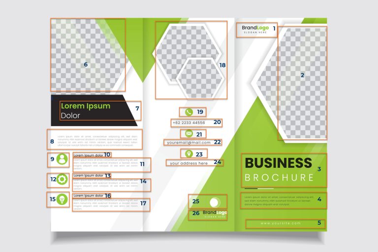
To avoid such errors, it is necessary to specify the correct reading order for each page manually. Automated PDF accessibility checkers lack the ability to determine the correct reading order unless explicitly directed. A human evaluator is needed to review the document and identify the intended reading sequence for each page. Once the order is established, it should be set so that the content can be read in the intended order. The image below exemplifies the correct reading order for a tri-fold brochure.
4. Heading Structure
Assistive technology users often rely on heading structure to navigate a document efficiently. By setting the assistive technology to read through only headings, users can quickly skim the contents and locate the information they need. However, while an automated checker can determine whether headings are present and whether the heading levels are nested correctly, it cannot assess whether the heading structure is adequate. For instance, a document with only one heading at level 1 may pass the automated checker, but it may not provide sufficient navigational cues. Moreover, checkers cannot identify situations where non-heading text is incorrectly marked as a heading or if headings have been skipped or mislabeled. Therefore, it’s important to manually review the entire PDF carefully to ensure the heading structure is sensible and useful for all users.
5. Link Content
Ideally, all links in a document should be active, allowing users to simply click on them to access the linked content, without the need to copy and paste the URL into the browser. This practice is beneficial for all users, not just those with disabilities. Although not all guidelines mandate active links, it is considered best practice to enhance the overall user experience. Furthermore, links should be presented as descriptive text that clearly conveys the target destination, rather than displaying the URL itself. This approach helps users to quickly and accurately identify the linked content, making navigation more straightforward and efficient.
For example, this URL: https://www.getremdoc.com/blog/the-ultimate-guide-to-document-accessibility/ should be written The Ultimate Guide to Document Accessibility. Using descriptive link text is important because it enables all users to easily identify the destination of the link without having to decode a lengthy and potentially confusing URL. By providing clear and concise link text, users can quickly understand where the link will take them and decide whether or not to follow it. Therefore, it’s recommended to use descriptive link text that accurately reflects the content of the linked page or resource.
Accordingly, Email Us is better than Contact Us when using an email address link. Checking that link text conveys meaning clearly is not something automated PDF accessibility checkers can accurately perform.
6. Language
Automated checkers can identify whether a language attribute is present in the document properties, and some can also detect whether characters within a tag match the specified language. However, in cases where a document is bilingual or contains text in multiple languages, these checkers are unable to verify if the language attribute matches the language of the text. Such inconsistencies can lead to errors like “Frenglish,” where screen readers attempt to read French words in English. To avoid such issues, it’s crucial to set language attributes not only for the entire document but also for any language changes within the document. This approach ensures that the language is accurately identified, providing a more effective and inclusive experience for all users.
7. Use of Color to Convey Information
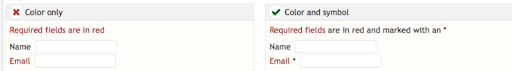
Using color to convey meaning in PDF documents, particularly in charts and graphs, can present accessibility challenges that cannot be identified by an automated checker. Approximately 8% of men and 0.5% of women have some form of color blindness, while individuals with low vision may have difficulty discerning color differences. Moreover, those using low-contrast or monochrome displays may not be able to perceive color variations at all. While color can still be used in PDF documents, an alternative method of conveying the intended meaning should also be employed to ensure accessibility for all users.
In this image, the left side uses only color to indicate “required fields,” whereas the right side uses both color and an asterisk to denote the required fields. The image on the right is accessible, while the one on the left is not.
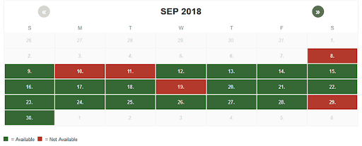
In this calendar example, green color indicates available days while red color indicates unavailable days. However, individuals with red/green color blindness or those using a monochrome display may not be able to distinguish between available and unavailable days. Therefore, additional information should be provided to ensure that all users can easily determine which days are available.
Another example is that links should not rely solely on a color change to be indicated. They should also include another method, such as an underline, to signify that the text is a link. This ensures that individuals who have difficulty perceiving color can still recognize links within the text.
8. Tooltips for Forms
Fillable forms often pose accessibility challenges, particularly when it comes to assistive technology (AT) navigation. AT uses the Tab key to navigate digital content, accessing fillable forms in two distinct ways.
Reading Mode vs Edit Mode
There are two separate ways that assistive technology (AT) navigates fillable forms: Reading Mode and Edit Mode. In Reading Mode, all visible information on the form, including field descriptions, is read aloud. In Edit Mode, the AT user can fill in the field(s). However, these two modes are entirely distinct from one another, making it challenging, if not impossible, to gather surrounding context to understand what a field requires. This is especially true when instructions for completing a field may be located to the left, right, above, below, or even on a separate page from the field itself (for instance, “see completion instructions on the reverse of this form”).
Avoid Ambiguity for Filling Form Fields
When assistive technology users fill in form fields, they must switch to Edit Mode, which makes any visible field descriptions unreadable. To provide instructions for filling in form fields in Edit Mode, a tooltip is necessary. While an automated tool can verify the presence of tooltips, it cannot determine their accuracy or helpfulness.
For instance, fields labeled “Date” or “Name” may be too vague to fill in accurately. Users need to know what type of date is required and how to enter it, such as MM-DD-YY or MM-DD-YYYY. Moreover, if the form is from a country where the date format is DD-MM-YYYY, the user needs to know that as well. Automated tools cannot assess if tooltips provide accurate information to answer these questions.
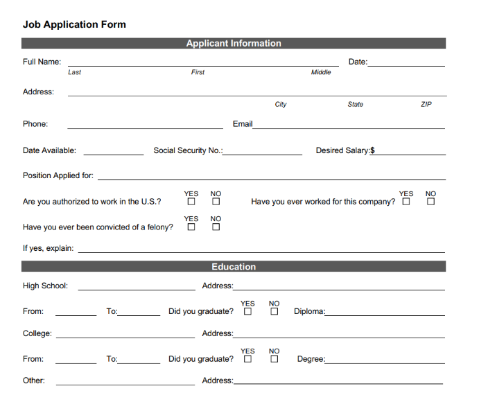
Forms often rely on visual proximity to provide context and clarify what is expected in each field. For instance, in the given example, instructions for entering one’s name are present both to the left and beneath the field. Similarly, the checkboxes for employment authorization include instructions both to the left and above the checkboxes.
Sometimes form fields are located within running text, requiring the user to gather context from both before and after the field to properly complete it. It is important to set tooltips for each form field, indicating any necessary formatting. However, it is important to note that PDF accessibility checkers can only determine if the tooltips exist, not if they are accurate or helpful.
9. Lists
PDF accessibility checkers cannot completely verify the accuracy and presence of lists. If list items are not correctly tagged as a list, assistive technology will read them as regular text, which can be a problem, especially with nested lists, as sublists will not be recognized as belonging to the parent list. Over 36% of assistive technology users consider lists to be one of the most challenging elements in PDFs. Therefore, it is important to accurately tag all list items, including any child lists, to ensure that assistive technology can read them properly.
10. Tables
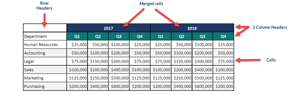
Over 75% of assistive technology users reported experiencing difficulties with tables in PDFs. When tables are not properly tagged, the information will be read as a jumbled mess of words, and the relationship between row and column headings and cell data will be lost. Complex tables with multiple levels of column headers, such as financial tables with years and quarters, require special attention to ensure that all headers are properly identified. Some accessibility checkers will give a passing result to a table with only row headers, even if it requires multiple levels of column headers. To ensure that assistive technology users can fully comprehend the presented data, it is essential to set all headers for rows and columns and associate all cell data with both the column and row headers.
It is important to include a summary for tables that provides users with additional guidance or information to better understand the structure and usage of the table. This may include information about spanned cells or any other relevant details. Although automated PDF accessibility checkers can verify the presence of a table summary, they are unable to determine if the summary accurately reflects the table’s content and purpose.
Beyond the Checklist: Usability
According to the Worldwide Web Consortium, usability involves designing products that are effective, efficient, and satisfying, including user experience design, which encompasses general aspects that affect all users, not just those with disabilities.
Usability is best addressed during the design or authoring phase, but when remediating a PDF for accessibility, there may be limited options to modify the document’s creation. In such cases, it is important to find simple and straightforward solutions that will benefit all users. For example, using alt text that directs readers to a data table on another page can be an effective alternative to complex images. Additionally, breaking down complicated tables into smaller ones can enhance their comprehensibility.
To gauge a document’s accessibility and usability, consider seeking input from people with disabilities and incorporating their feedback.