
What is Alt Text?
Alt-text is one of the most basic elements of document accessibility. For people who cannot see images contained within a document, a text alternative describing most images is required. However, not all images require alt text descriptions. Repetitive logos and decorative elements such as watermarks can be artifacted and not given alt text. Learning to provide useful alt text is a skill that can take some practice.
How do you know what to write?
When writing alt text, always keep in mind that “understandable” is one of the pillars of WCAG philosophy. Text alternatives should be concise, accurate, and relevant. Read the text surrounding an included image to see how much additional information is actually conveyed by the image versus already present in the text. The relevance of the image within the document informs how the alt text is written.

For example, this image of Abraham Lincoln that hangs in the White House might have different alt text if it is contained in an article about paintings in the 19th century, versus an article about White House history, or an article about Abraham Lincoln himself. In the first, you might mention the painting techniques, in the second you might include where in the White House this painting can be found, and in the last, you might just say “Painting of Abraham Lincoln by George Healy 1869.” It’s important to always be aware of the context for which the image has been included.
It’s Complicated
Some images and graphics are extremely complicated and difficult to describe concisely while still providing relevant information. Elements such as pie charts, line graphs, organizational charts, maps, and flow charts can require hundreds or even thousands of words to describe them. This is often necessary in order to supply a text alternative that provides the same information being provided by the image.
Unlike regular text, alt text cannot be broken into paragraphs or contain headings. This means lengthy alt text descriptions can be very difficult to use. If there is a 1,500-word description of a chart or graph, an assistive technology user who wants to double-check a fact part-way through may have to reread the ENTIRE alt text to find what they need. There are, however, alternative ways to present the same data that may not require such a lengthy description.
A picture is worth 1,000 words…
Charts & Graphs
Usually, the absolute best alt text for any chart or graph is something like:
“Chart showing an upward trend over time; refer to the data table on this page for specific details.”
If possible, include the source data table for any chart or graph within the source document. If that isn’t possible, depending on the complexity of the chart, either general trends should be described, or each data point should be described in the alt text. Consider the intended context of the graph when determining how much detail to include.
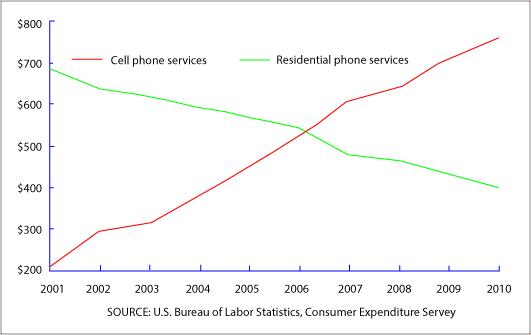
This graph can be described relatively simply.
“Line graph showing an upward trend in cell phone services from 2001 through 2010, with a corresponding downward trend in residential phone services over the same period.”
For this particular bar graph below, however; it is necessary to provide the various data points in order to convey the information. So you would write something like:
“Graph of favorite cereals by vote. Life 6 votes, Cornflakes 4 votes, Kix 3 votes, Cheerios 2 votes.”
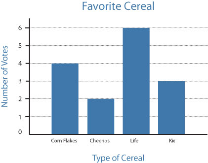
Notice that these figures have been arranged in descending order. This allows for an easier understanding of the trends. It would be of more importance if there were a list of more items on which to vote, but this method of arranging in descending (or ascending) order should be used unless the graph has other sequential structure to consider (such as dates). It is easier for assistive technology users who have visual or cognitive disabilities to understand the data being presented. That way if the user needs to quickly find the highest or lowest value, it is much easier than re-reading every item again. Note also that “votes” has been spelled out each time. This avoids confusion about what the various numbers are referencing.
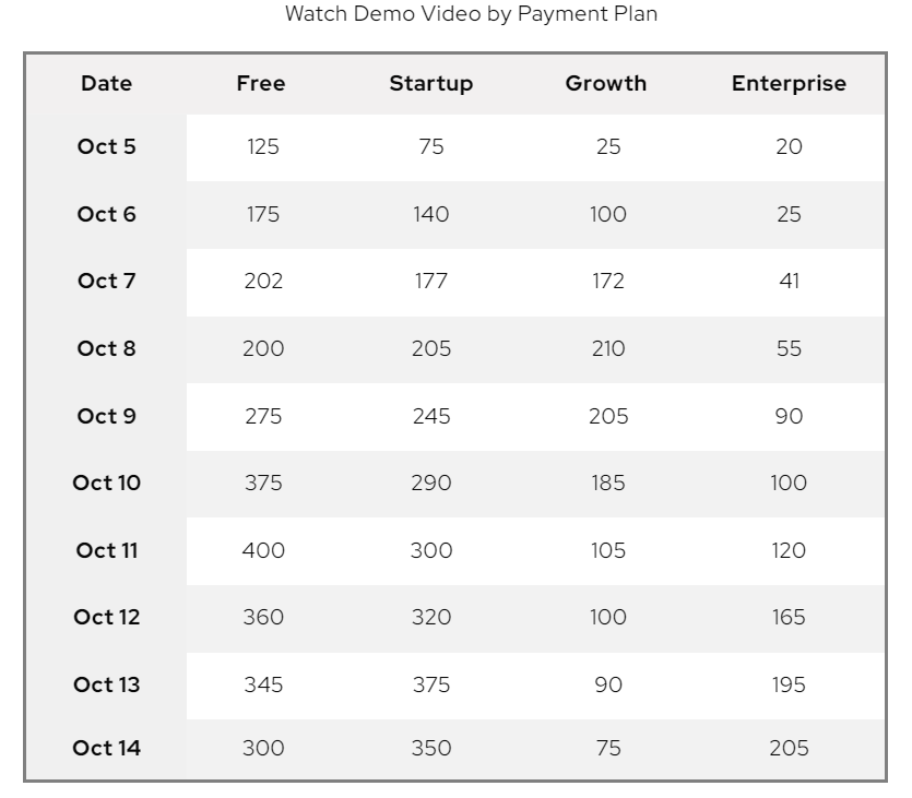
For more complex graphs, you can create custom elements within PDFs that do not alter the visual appearance of the document. The image can be tagged with alt text that has been added to provide a less cumbersome alternative to lengthy alt text. For example, if you do not have a data table available for a graph, it is possible to create one that assistive technology users can read, but will be hidden from visual users of the document.
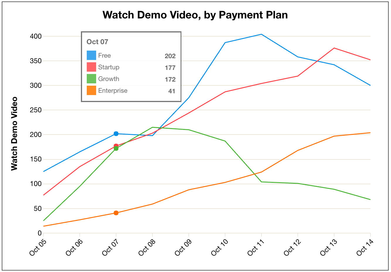
So for this particular graph above, the table might have dates as row headings, the various payment plans as column headers, and the data points can be filled in for each of the various cells. The added table below would allow assistive technology users to get a full understanding of the graphed information. Alt text for the image of the graph would refer to this table
“Graph of trends for Demo Video, by Payment Plan. Refer to the data table which follows.”
The table would be included immediately after the graph image in the reading order.
Maps
Maps can be extremely difficult to describe accurately using alt text. Often the alt text used is simply “map of…” This is not especially useful for an assistive technology user who might actually want to know how to get from point A to Point B or the location of a specific destination. However, if the information conveyed by the map (directions or specifically cited locations like mailboxes or coffee shops) is thoroughly covered in the text of the document, the alt text “map of mailbox locations” might be perfectly appropriate.
Be cautious of using N, S, E, and W directions when describing a map unless the top of the map is actually facing north; otherwise, your directions may be inaccurate. Sometimes referring to GPS coordinates (if available) can be helpful as many assistive technology users make use of the GPS on their smartphone to navigate their environment.
Remember the context of the map needs to be considered. It’s not always necessary to describe the entire map. The map below could take hundreds of words to describe in the alt text.
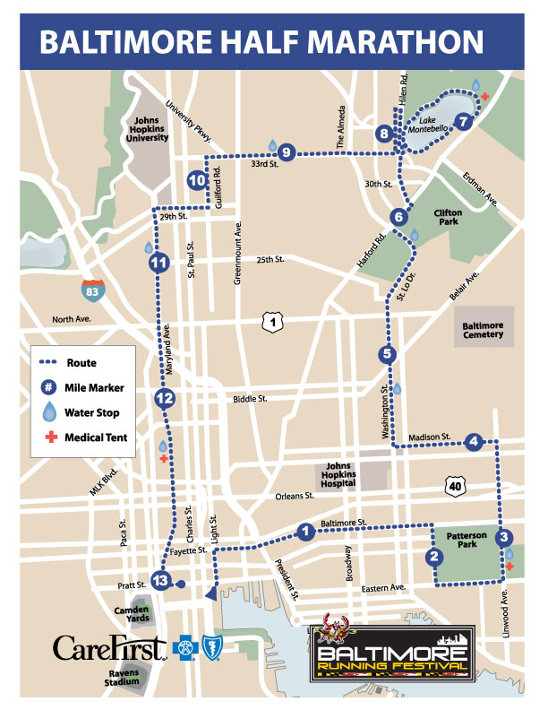
However, the best way to provide the intended information for this particular map is to give clear directions to each point listed on the map. So, you might write:
“Map of the course for the 2021 Baltimore Half Marathon. Start at the intersection of Pratt and Light streets. Make the second right onto Baltimore Street. Turn right at the fifth intersection at Patterson Park. Then take the next left onto Eastern Avenue and proceed one block. Turn left onto Linwood Avenue.…”
and so on, describing the path of the marathon. This is the information intended by the map. Again, if the text around this map already includes step-by-step directions, it is not necessary to reiterate them in the alt text.
“Map of Route for 2021 Baltimore half marathon”
will suffice.
Organizational Charts
Organizational charts are another tricky element to describe using alt text. The more complex the org chart, the more words are required to accurately present the information. It can become very cumbersome to navigate alt text describing an organizational chart if there are a large number of elements.
Many organizational charts can be depicted using a nested list. Simply create a list and use text to enter the elements of the org chart and voila – easy to parse information for an assistive technology user. The alt text for the org chart will then refer to the added nested list for the necessary information. The nested list should immediately follow the org chart image in the reading order. Here’s an example:
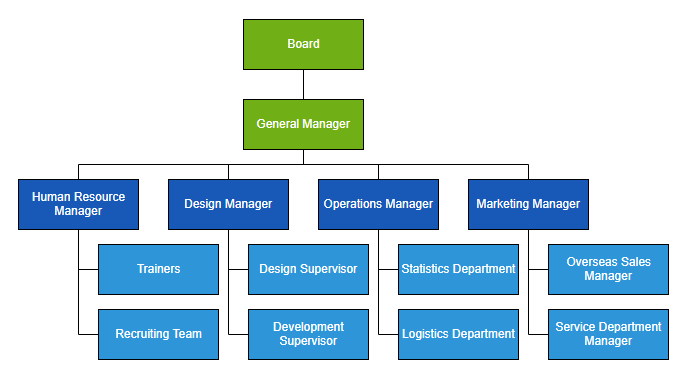
This organizational chart would be complex to describe as alt text. However, it can be rendered as a nested list, like so:
- Board
- General Manager
- Human Resource Manager
- Trainers
- Recruiting Team
- Design Manager
- Design Supervisor
- Development Supervisor
- Operations Manager
- Statistics Department
- Logistics Department
- Marketing Manager
- Overseas Sales Manager
- Service Department Manager
- Human Resource Manager
- General Manager
Flow Charts
Flow charts can consist of many elements requiring a lengthy description as alt text. The more interconnected the elements of the flow chart, the more lengthy the description.
This chart below can be described using regular alt text without the risk of it being too long. However, each item can also be given its own graphic zone, with each zone describing its relationship to the others.
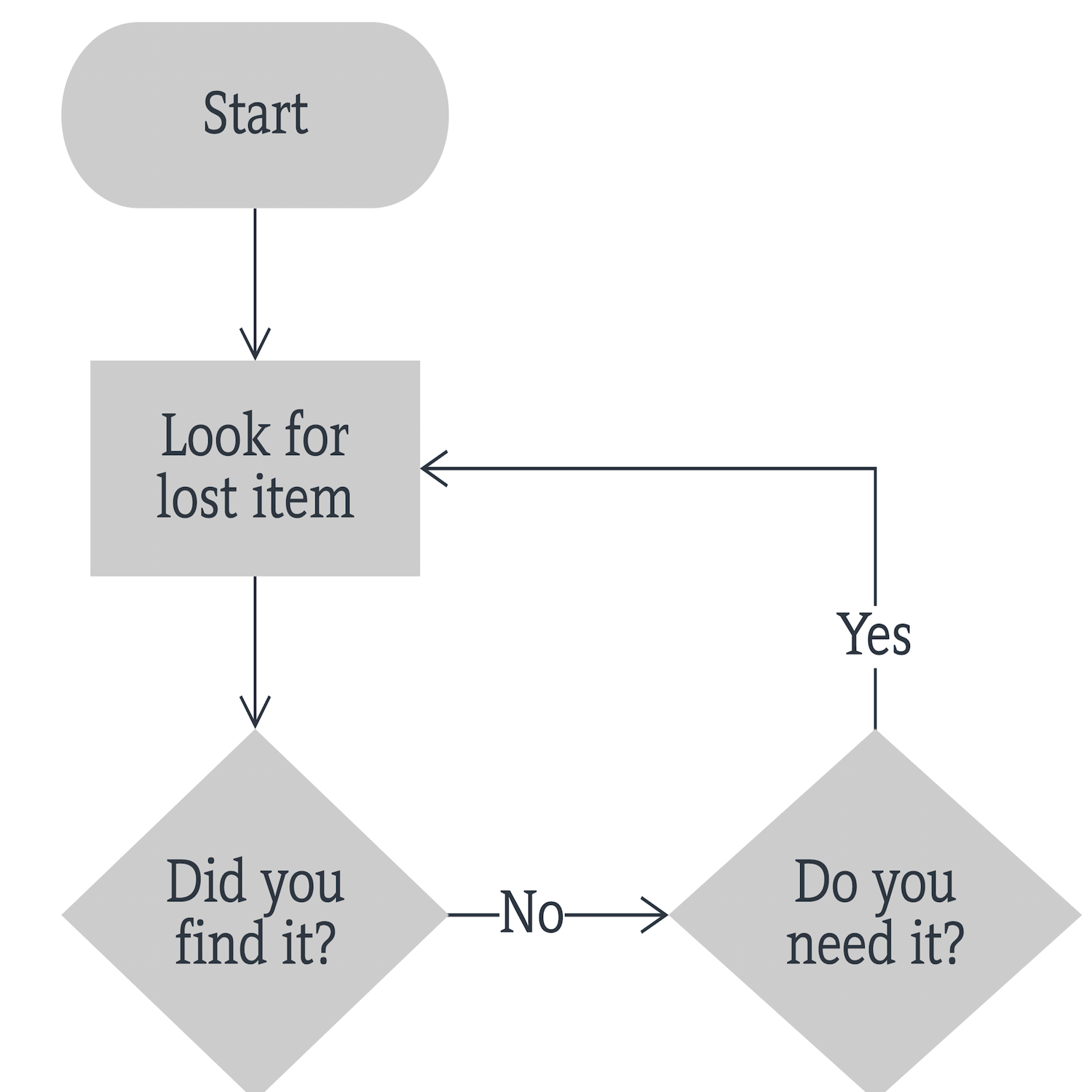
You can provide separate alt text for “Start” (“Start”), “Look for lost item” (“Look for lost item”), “Did you find it” (“Did you find it, if not, continue to next step”), “Do you need it?” (“Do you need it, if so return to Look for Lost item.”) The additional graphic zones would also need to be labeled with the correct reading order.
What about Hybrid Technologies?
Some assistive technology users with low vision may use hybrid technologies such as ZOOMText Fusion, a solution that zooms in on the page and also functions as a screen reader. When using this technology, the user is seeing what is on the page greatly zoomed while hearing the digital tags read aloud by the screen reader. The use of this kind of hybrid technology may mean that some of these invisible PDF tags may be confusing. If the zoomed visual area isn’t focused on the same part of the graph that the screen reader happens to be reading, the information may not be conveyed as cleanly. You may wish to add a custom text field informing hybrid technology users that you’ve added tags to facilitate screen reader use.
Concise, Accurate, Relevant, and in Context
When writing alt text, always consider the context of the image and why it’s important to the specific document in which it’s located. It sometimes requires a fair bit of creativity to convey the information in the most usable way. Consider how difficult it will be for an assistive technology user to read through complex alt text and keep it simple by conveying only necessary, relevant information.
Get inventive about how to make the information in the document’s images function as value-added rather than just more text to read. Strive to simplify and break down complex images. Also, remember the “understandable” pillar of WCAG philosophy and keep it top of mind when adding alt text.
Contact us to learn other ways that RemDoc can make your PDF remediation faster and easier.


